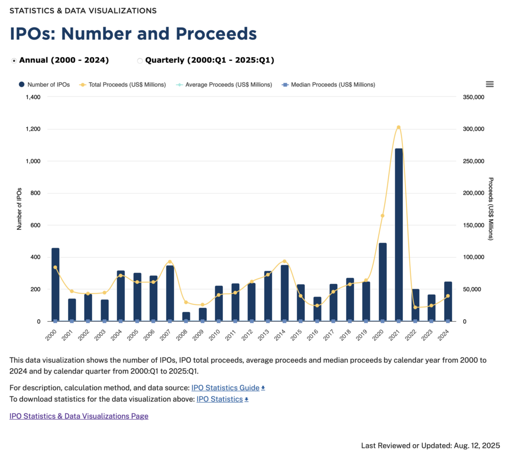
As we discussed in this blog post, on August 13, 2025, the SEC published a new webpage that provides a wealth of information about capital market transactions, participants, activity and investors. As an example, included in the data visualizations is this graph about IPOs:
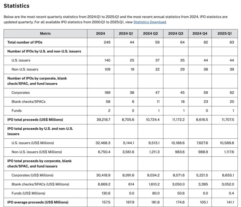
Underlying the graph is a tabular presentation that further breaks down the underlying data. The image below is a portion of this table:
As always, your thoughts and comments are welcome!